Completely get the appeal. You describe what you want, something appears, and it looks like a website. Not long ago that took three weeks and a bill to match.
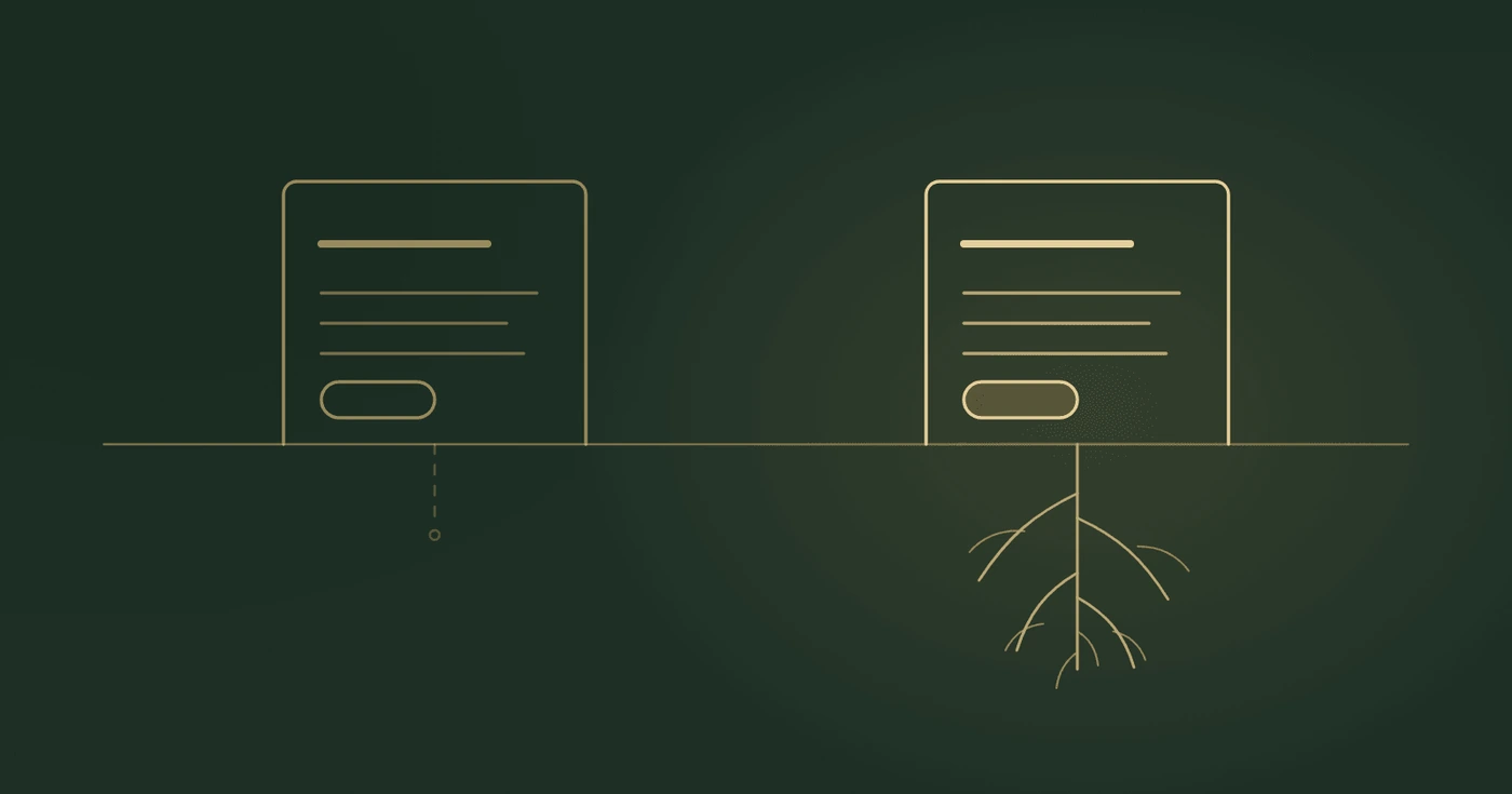
So this isn't a lecture about the tools. It's about the gap between a site that looks finished and a site that works. Vibe coding closes the first gap in an afternoon and never mentions the second one.
What It's Genuinely Good At
Getting something on screen. Ideas are cheap to describe and expensive to mock up, and these tools collapse that entirely. You can look at three versions of your homepage before lunch and discover the one you were certain about is the worst of them.
It kills the blank page, too. Most people struggle to start rather than to finish, and something ugly to react to beats a perfect brief every time.
And it's good for working out what you want. Plenty of people can't tell you what they need but can tell you instantly what they hate.
If that's what you're using it for, crack on.
Where It Quietly Falls Down
None of these failures are dramatic. Nothing looks broken. That's the issue.
It builds for the screen in front of you. Your laptop, your browser, your connection. The preview is a lie of omission. Older phones, Safari, a patchy signal in a car park, someone with text size turned up. The result will be roughly right and specifically wrong.
Forms are the usual casualty. A generated contact form often submits to nothing, or to a service you never configured, or sends mail in a way that lands in spam. It says thanks either way. You won't find out from the site. You'll find out from the customer who mentions they emailed twice.
Search engines want boring things. Page titles that differ from one another. Descriptions. A sitemap. Headings in an order that means something. Pages that exist as real addresses rather than states inside a JavaScript app. An AI builder will happily produce a beautiful page titled “Home” with no description, and Google will treat it exactly as seriously as that suggests.
Legal admin doesn't get prompted for. If you're in the UK and collecting anything at all, you need a privacy policy, and if you're setting non-essential cookies you need consent handled properly. Nothing in the build process reminds you. It's the least interesting part of a website and the only part that generates letters.
Weight. Generated sites love a full-screen video and a four megabyte hero image. Fine at your desk, miserable on a phone, and invisible to you because you've got the whole thing cached.
Words. The copy will be fluent, confident, and identical to everyone else's. Tailored solutions that put your customers first. It reads as competent and says nothing. That was always the one part of the page that had to come from you.
The Question That Actually Decides It
Not whether you can build it. Whether you can own it.
Three things to check before you get attached to what you've made.
Where the domain lives, and whether it's in your name, on your account, paid with your card. Not the builder's. Not a friend's.
Whether you can get the site out. Some tools hand you the files and let you host wherever you like. Others don't, and that difference only matters on the day you want to leave, which is the worst possible day to discover it.
Who fixes it in eight months. You'll have lost the context. The tool will have changed. The thing you need to alter will be one line inside a component you never read. Not impossible, just a completely different job to the one you enjoyed on that first Saturday.
That last one is the real question. Building is the fun bit, and it's about ten percent of a website's life.
If You're Going Ahead Anyway
Do it. Then before you tell anyone it exists:
Fill in your own contact form from your phone and confirm the message arrives. Open the site on the oldest phone in the house. Run it through PageSpeed Insights and fix whatever it complains loudest about, usually images. Give every page a title that isn't “Home”. Rewrite the copy yourself, badly, in your own voice, instead of keeping the polished version. Put the privacy policy up.
That's an evening. It's also the difference between a site that looks like a business and one that behaves like one.
And if the Budget Is There, Spend It
Put a vibe coded site next to one built by someone who does this every day and the difference isn't subtle.
It isn't taste, and it isn't fonts. It's the hundred decisions underneath. How fast it loads on a bad connection. Whether the form works on every phone rather than most of them. Whether it can be changed next year without starting again. Whether it shows up in search at all. Whether someone using a screen reader can buy from you.
None of that is visible in a screenshot. All of it turns up in what the site brings in.
A website is one of the very few things in a business that works while you're asleep. If you can afford to have that done properly, have it done properly.
And if you can't yet, build it yourself. Just go in knowing which corners you're cutting, so you know what to come back for.